Queen Isabella II
![]()
![]()
![]()
January 1863
5-Cuartos
|
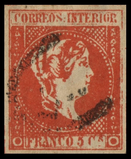
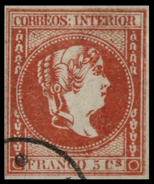
Gooding #14F1 Lithographed in vermilion on thick, hard, very white wove paper.
There is a colon after 'CORREOS'. Both upper and lower inscriptions are in
ordinary Roman capitals. There is a very thin, broken outline under 'CORREOS
INTERIOR', which is some little distance from the upper outline of the rest
of the stamp. There are three bell-shaped ornaments, and part of a fourth, in
each half of both side-frames. Some of them are very indistinctly drawn, and
they vary much in shape. There are seventy-five very small white pearls round
the head, none of them being oval, and some of the being mere dots. The
fish-scale ornamentation in the spandrels is very poorly imitated by a
lattice-work of crossed, straight, oblique lines; the whole being much too
dark, almost as dark as the side-frames, instead of quite light. The wreath
is very blotchy. There seem to be six leaves, without veining. The shading of
the hair is in dark, solid patches, instead of lines. There are no visible
leaves at the back of the neck, where the ribbons come out of the hair. The
letters of the lower inscription touch the outline of the label above them;
but they are no taller than those of the upper inscription. There is a dash,
instead of a stop, under the little 's' of 'Cs'. The
end of the ribbon, which comes across the neck, is not at all wavy.
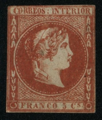
Gooding #14F2 A dangerous imitation. Color nearer scarlet. Dots of the circle are quite
irregular and too small. Letters in the upper label vary in height. The 'C'
and 'OS' of 'CORREOS' are lower than the other letters. The bell shaped ornaments
generally open wider than in the genuine stamp. Dots of the circle are quite
irregular and too small.� The loop in
�5� is narrow and the top horizontal line is long and solid.
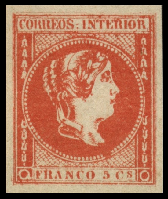
Gooding #14F3 The 'C' of 'CORREOS' is too near to the left frame and too tall
and the second 'R' is too large. The second 'R' of 'INTERIOR' is too wide at
the bottom, and leans slightly to the left. The circle almost touches the
line at the top and bottom, with only one row of the fish-scale network above
the top of the central circle and two below the bottom of it. There are
nine-two pearls round the central circle, and they are all distinctly
separate from each other, except two near the chignon; whereas in the
genuine, some of them run together. The Queen's lip is pointed somewhat
upwards. The bust is too much pointed. This forgery was first noted about 1890.
Known unused or cancelled. Also known privately perforated (Perf 14). Largest Known Multiple: Block of 4 (Nigel
Gooding Collection). (Similar plate to Gooding #15F1, #16F1 and
#17F1).
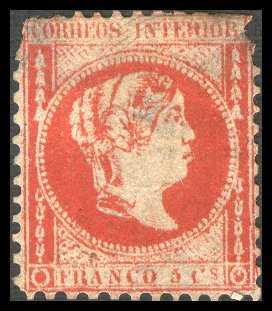
Gooding #14F4 The 'CO' of 'CORREOS' is lower than the other letters. The first
'R' of 'INTERIOR' has a wide top loop. The circle almost touches the line at
the top and bottom, with only one row of the fish-scale network above the top
of the central circle and below the bottom of it. The bust is pointed and
closer to the circle of pearls than the genuine. The '5' in '5 Cs' has a long
staff and wide bottom loop and there is no period to the right of the 's' Known cancelled.
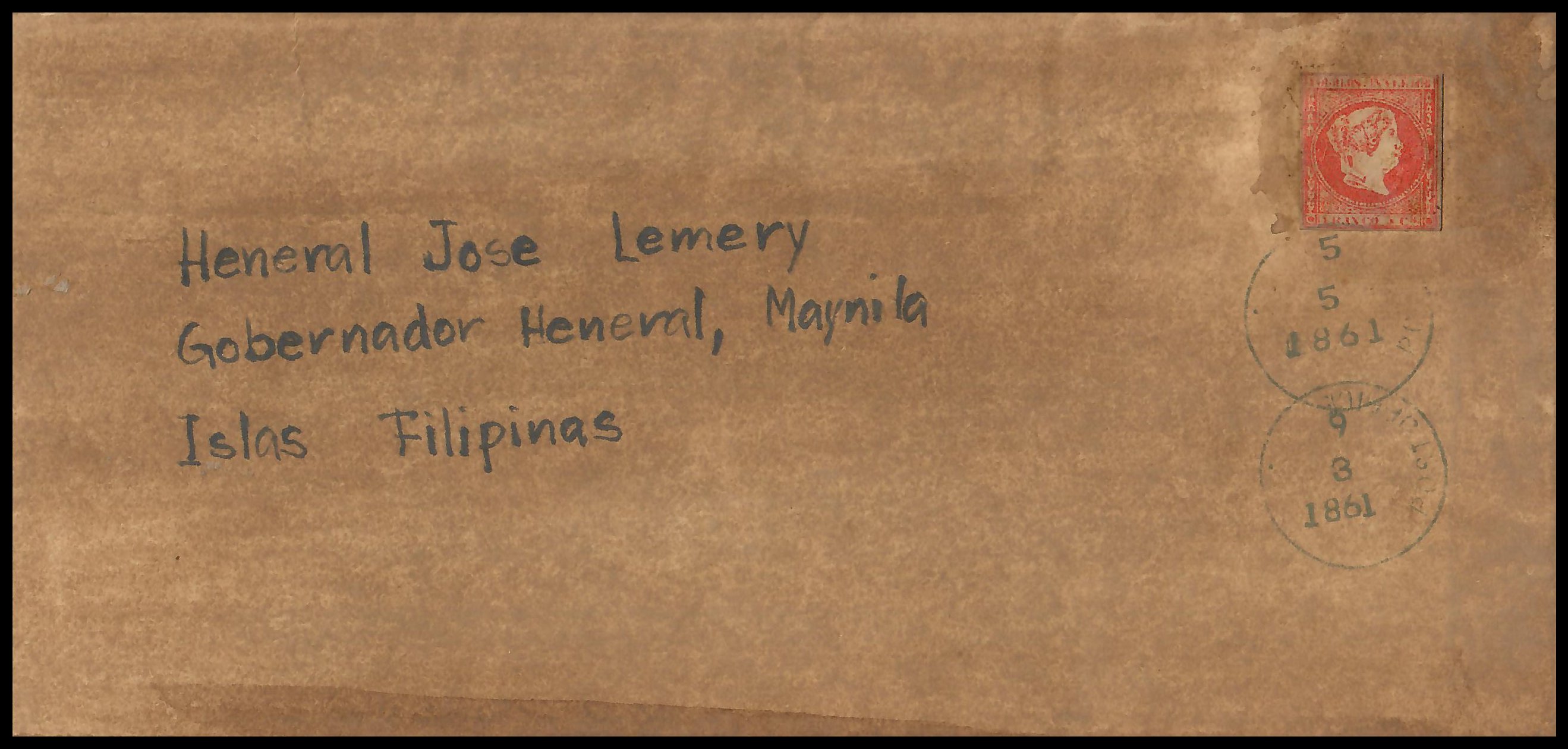
Gooding #14F5 Crude forgery printed in carmine, very similar to the original
issue. The lettering on top and bottom tablets are
poorly stuck, with many broken or partially missing letters or numbers. The '5'
in '5 Cs' is almost non-existent. Two known copies,
both affixed to bogus cover and
tied with forged cancellations.
|
![]()
Comments and Feedback Always Welcome ....
Please Email
Return to Home Page
![]()